Monday, November 30, 2020

ART281 - Current Changes, and Adjustments to NLP

To say that the world has been chaotic recently is an understatement, as the government Covid-19 guidlines keep consistently changing. So after some consideration, I have decided to focus this project more on evaluating my own artstic ability, in order to keep others safe. 

My final outcome will be a reflection of my overall project, commenting upon my body of work and how I approached each work with subconscious expressionism in mind. The restrictions in each experiment force me to just create rather than think, eventually painting a picture of how my emotions take hold when producing art.

The artists I am researching a still valuable despite this change, as they will allow me to broaden my knowledge of how different abstract expressionists, conceptual artists, and performance artists think. By evaluating and comparing their work, I will have a wider range of knowledge in regards to artistic intention, and how to successfully present ideas to a viewer.

This change has affected the project, so I will reflect upon the overall success of this when discussing how my project went at the conclusion of this module.

Sunday, November 29, 2020

ART281 Research - Alberto Greco

Argentine conceptual artist Alberto Greco's work focused on a deeper message rather than traditional aesthetic. Fascinated by the trivial and quotidian, he notoriously created the 'Vito Dito' ('Living Finger') series in 1962. Greco intended to draw attention to the everyday occurences of life by signing multiple people, animals, and objects. It was also recorded that he drew circles on the ground, signing his name near them, and in one instance he apparently would not let a man leave the circle.

Greco rebelled against artistic normality by not limiting himself to flat canvasses, allowing artworks to conceptually reach gigantic proportions. The seeking out and drawing attention to objects reminded me of Marcell Duchamp's infamous 1917 'ready-made' sculpture titled as 'Fountain', which boldly placed a urinal into an art gallery setting. It is interesting to see how Marcell Duchamp's work has influenced art, and how this could possibly have lead to Greco's 'Vito Dito' idea.

I also found it fascinating when reading about his personal life, and multiple controversies. For example, his first live exhibition was called '30 Mice From Neo-Figuration', which was a glass box painted black in the interior, also containing thirty mice. Due to the apparent smell, Greco subsequently had his work removed from the gallery. His dedication towards artistic intention and becoming fulfilled through his work has inspired me to consider approaching my own artwork in a more abstract manner.

His mixed media work also is inspiring me to explore using collage for this project, as it would be interesting to reflect upon how the medium allows the artist to express themselves subconsciously.

J.F. Kennedy Assassination, Act 1, 1962-1963

Friday, November 27, 2020

ART280 - P8 - Dan Seagrave: Artist Influence Reflection

Despite primarily working with death and grind metal artists, Dan Seagrave's influential works are also key in inspiring this project. Seagrave became notorious for his intensely detailed surrealist landscape work, such as for his painting for the band Entombed's 1990 release 'Left Hand Path', and during the same year, Nocturnus's album 'The Key'.

I already had seen a large amount of his work because of my passion for extreme metal music, however upon digging deeper I found a series of figurative works that Seagrave describes as 'not exactly pretty' which he created over the course of 2002. One painting in particular caught my attention, which was a 4' by 6' acrylic on canvas piece titled 'Walking The Skin'. The figure in it is distorted and almost melts into the background, implying that it is 'emerging' from it. Earthy colours highlight the pallid skull of the entity, whose head loosely faces the viewer upon their androgynous body. 

This painting really inspired me for a number of reasons, one of which was the use of lighting. There is a light source, not in frame, that is to the top right of the painting. It highlights the top of the entity's head, the right side of their body, and the top of their right arm. It highlights the skin tone of the entity which allowed Seagrave to imply, rather than outright realistically portray, areas of bone and tendon. I thought this was fascinating, and would like to explore depicting more macabre subjects with subtetly through form and tone management.

The earthy coulours are visceral, and remind me of both the human body and metal corroding over time. Also, due to Seagrave's mark making technique, it appears as if there is a scratched-up foreground which reminded me of an old photograph. I would like to experiment with these colours as I feel it would appropriately and successfully allow me to portray my own disturbing subject matter, however I will adjust my approach so my work fits more into traditional black metal aesthetics.


'Walking The Skin', 2002


Thursday, November 26, 2020

ART280 - P8 - Francis Bacon: Artist Influence Reflection

Francis Bacon's artworks are violent, raw, and disturbing, producing twisted figurative works that often came in a series. His use of gestural technique in his portraiture work helped inform me on how important mark making is in regards to portraying emotion. The blend of expressionism and cubism I thought was very interesting, which also reminded me of how impressionist painters create the illusion of blending through technique alone, similar to how Bacon approaches certain portraiture artworks.

His work made me also realise how important colour and contrast is in creating atmospheres, such as with 'Three Studies for a Crucifixion'. Large areas of colour highlight the raw subject matter, creating a backdrop that eerily forces the viewer into facing the violence central to each painting in the triptych. The orange itself implies a spontaneity, but Bacon takes this a step further by allowing it to coexist with a blood-red, which I thought conveyed fear and discomfort when paired together. These stark blocks of colour work in conjunction with the black voids to add an overarching mood of dread, as in my opinion, Bacon intended to suffocate the viewer with this eerie contrast.


'Three Studies for a Crucifixion', 1962


ART280 - P8 - Theodore Kittelsen: Artist Influence Reflection

Theodore Kittelsen was one of the most prominent artists and illustrators in Norway, creating artworks depicting entities and landscapes central to Norwegian culture. Primarily focusing on creatures from traditional folklore, his paintings have remained popular in both mainstream and underground culture. Varg Vikernes is a controversial figure in black metal who is infamous for murdering his former bandmate 'Euronymous' out of self-defense, and he used several of Kittelsen's artworks as album covers. Vikernes was influential for his music in the second-wave of black metal, and arguably popularised using Kittelsen's art in the scene.

I have been a long time fan of Kittelsen's artwork, so I used this opportunity to explore the artistic legacy he left behind. I also avoided going in depth into Kittelsen's works that I am most familiar with, particularly ones used on numerous Burzum albums. One artwork in particular really stood out to me, titled as 'Moria Soria Slott' (Moria Soria Castle) from 1911.

The title was taken from a traditional Norwegian fairytale, which symbolises a journey towards tranquility and happiness, however the 'castle' in question is extremely hard to find. Kittelsen captures this idea of a journey into the unknown, by depicting a vast landscape of deep valleys that fade into a fog. A faint light can be seen in the distance, with a figure proceeding towards it on horseback. 

I love the atmosphere of this illustration, and the focus on the overwhelming presence of nature. However, no flora nor fauna can be scene, and instead Kittelsen uses form and tone to create an overwhelming sense of isolation amongst an unforgiving wasteland. This once comic fairytale now becomes a story of existentialism and isolation, purely from Kittelsen's characteristic neo-romantic darkness. It also inspires me how the brown-grey colour pallet adds rather than take away from the piece, proving how beneficial form and tone are to art. I am glad that I found this artwork, as I feel it has really helped inform me on black metal aesthetics as well as the importance of tone and form.


'Soria Moria Slott', 1911


Wednesday, November 25, 2020

ART281 - Experimentation - Five Minute Biro Drawing Challenge

After reflecting upon the results of the last drawing challenge, I decided to use a similar approach from a different angle, and evaluate how different the outcome is. So for this experiment, I am seeing how many faces I can confidently draw, in my style, for no longer than five minutes. I used a sheet of A3 paper, and restricted myself to only use a black biro or graphite. 

The results of the five minute drawing challenge.

Although I am happy with the drawings I did create, I would not necessarily label this experiment as a full success, despite the results still being valuable. Over the five minutes, I got caught up with including specific details, primarily on the very top and bottom faces. Although I am happy with the execution of these two, the other two heads were created out of necessity to include more faces. This resulted in them lacking the detail the other two faces possess.

If I were to conduct this experiment again, I could consider abstracting my designs more, in order to create more faces. The quality of the two faces I worked on the most in this experiment however were executed, in my personal opinion, in an expressive yet concise way.

ART281 - Experimentation - Timed Oil Pastel Challenge

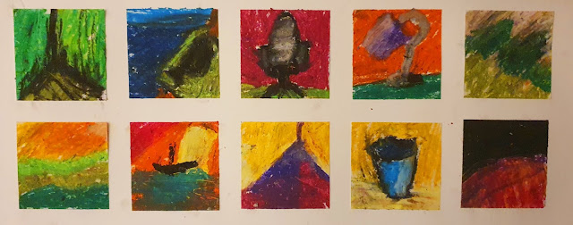
In my opinion, my personal artistic weakness is my incorporation of colour in regards to my paintings and drawings. So for the next experiment, I decided to challenge myself as an artist and reflect upon the results by introducing oil pastels.

Similar to my timed drawing experiment, I only gave myself a minute to complete each drawing, with a thirty second rest period. However, I gave myself no general outlines on the subject matter and had a vast array of colours available. I knew from the start how hard this personally would be for me, but I thought that the outcome would be really interesting.

The results of the timed oil pastel experiment

The end result of this project is crude due to the time limit, however the results were very interesting. For example, I switched from drawing objects, to landscapes, to abstract objects, consistently switching subject matter. Surprisingly, I enjoyed creating these during the challenge, as the introduction of colour theory forced me to consider the colour pairings as well as the subject matter. Also, because the paper squares used were only two inches by two inches, the size of the oil pastels often posed an issue when adding any sort of details, however this did not remove much from the enjoyability.

I personally found this particular process therapeutic as it felt more like a personal challenge rather than an experiment, possibly due to the fact I had the freedom of choosing my subject matter. Therefore, I will allow myself more freedoms in these experiments, however time limits and certain guidelines will have to be adhered to strictly for the best possible results.

Tuesday, November 24, 2020

ART280 - P7 - Shaun Project Space Crit Reflection

Over the course of this project so far, many of my peers have presented their work in the Shaun Project Space. This is so that everyone particpating in the course has a chance to get their work reviewed and discussed.

Some of the work has been inspiring, from paintings, to drawings, to experimental mixed media pieces, I am glad to be part of a course with so much talent. It is unfortunate that I have been unable to have my work presented, as I currently live two hours away from the University and have been unable to attend due to Government guidance. Those who could not attend were given the opportunity to present their work online, however I became ill due to a longx term condition and missed this valuable asset to my course at that time. 

However I managed to gather small amounts of feedback over the course of my project from tutors and people closer to where I am. I think my main artistic weakness is scale, as my practice up until this point primarily consisted of smaller A4 to A3 works, both painting and inkwork. I have been told that I could incorporate more detailed backgrounds, which would allow me to explore different forms and compositions that potentially will benefit my overall theme. 

Doing more anatomical and figurative drawing studies would also benefit me, as this would inform me moreso on portraying subjects on different angles. Also, studying how the body moves and contorts through exploring pose is an idea that I could consider for more believable portrayals of the human body.

Monday, November 23, 2020

ART281 - Experimentation - Timed Small Scale Drawing

Due to the current circumstances and unpredictability of global events, I chose to conduct some artistic experiments on myself rather than to involve others, which could pose a safety risk. This ultimately will improve my artistic ability, and lead to more personal reflections regarding the results gathered from this project.

For this challenge, I wanted to explore how I personally would approach creating ten very small drawings, only allowing myself a minute to complete each one. Each drawing had to be improvised, with the only overarching theme being 'faces'. I would give myself a brief thirty second break in between each work, in order to prepare myself for the next drawing. This allowed me to explore how I would approach my particular style under such circumstances, and reflect upon the results.


The results of the timed drawing experiment

I noticed how the quality of each drawing, in my opinion, vary at a seemingly random degree. For example, drawing number 4 (counting from the top left to the bottom right) feels as if the artistic decisions made were more intentional than what is visible on image 2,3, and 8. This was due to the varying degrees of stress that were caused by the strict guidelines. As a result of them however, I became more experimental with my use of shapes and form. Also, because each drawing had to be finished after one minute, I had to decide which elements were more important to finish than others. I found myself always making sure the shape of the head, the eyes, and the teeth were finished at least twenty seconds before the timer was up.

Overall, this experiment has been valuable in contributing towards my learning experience and the results gathered from this project. Because this was a success, I will conduct more of this experiments.


Monday, November 16, 2020

ART281 Research - Hermann Nitsch

Austrian born avant-garde artist Hermann Nitsch's work has been so controversial over the years that he has recieved three prison terms due to the 'grossly indecent' imagery he creates, that apparently 'incites violence'. Straight away, I find it admirable that he has always stood by his messages and intentions, which is a valuable quality for an artist to have. Despite backlash, he displays gorey, bloody work that ultimately reflects upon his own life. A lot of his work centres upon his experience during late World War 2 and the aftermath. Nitsch does not want to provoke audiences with this bold work, and never intended to in the first place.

I really enjoyed perusing his body of work, especially his 'Pour Painting' series that come across as violent and visceral. The red 'blood' splatters and their spontaneity reminded me of Jackson Pollock's notorious technique of dropping paint, from a height, onto a canvas. Unlike Pollock however, Nitsch lets the paint travel down the canvas using gravity, which implies an intense assault reminiscent
of a gunshot wound.

After looking into his background and approaches, Nitsch has inspired me to explore the idea of aggression and violence more in painting, as he proves how effective of a tool it can be when conveying such themes. The parallels between his work and the brutality of war are fascinating, which is why it is so unfortunate that many interpreted his work crass and hateful. I personally think both his themes, and his artistry, symbiotically work together to create stunning, bold works of art.


Poured Paint, 1963

Tuesday, November 3, 2020

ART280 - P6 - Artwork Reflection 3

I wanted to create a mock band logo to convey my message, so I decided to call the fictional band 'Orgreave', and incorporated an abstracted silhouette of The Tyne Bridge. The architecture of this bridge is recognisable for anyone from Northumberland or the Tyne and Wear region, which is why I chose to include the famous curve of it.

Despite the fact that Orgreave is in Yorkshire, vast amounts of people from Tyne, Wear, and Northumberland took part in the miners strikes. The decline of our region's shipbuilding and mining industry lead to a lot of localised protests. Because this was such a monumental event in Northern history, the Newcastle symbolism combined with 'Orgreave' is successful in conveying my project.

Line was very important for this piece, as ultimately this symbol has to be reasonably superimposed onto other images, and replicated. I wanted some form of order, combined with a chaos, which is why I chose to include the additional 'dripping' coming from both the top of the logo and the lettering. I also think that the logo traditionally fits with the extreme, and sometimes unreadable, aesthetic of black metal logos as a whole, due to the distortion and shaping of the font. This may be altered over the course of the project, and after enjoying the process of creating this logo, I am considering including more for the final outcome.


ART281 - Negotiated Learning Plan: Personal Evaluation

Back when this project started, I was under the impression that the UK had control over the pandemic, however over the course of this projec...